|
 The Many Covers of LIMINAL STATES 01.12.12 - Zack - permalink
Creating the cover for LIMINAL STATES has been an exhausting process between those of us working on the creative end of the project and my publisher. The book project almost died because of conflict revolving around the cover. I won't delve into the specifics of that too much, but it's worth touring the many versions of the cover that have existed throughout the project and tell the story of how we ended up with the glowing grasshopper you have seen so many times.
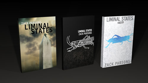
Cover #1: Among the Vicissitudes
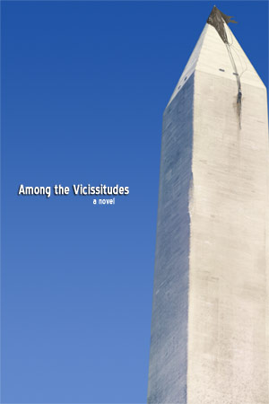
This preliminary mockup was created by me about six months into the project based on a simple, creepy piece of artwork created by Josh Hass. It was never meant to serve as the final cover, but more of a guide for the austere ideas I had for the cover. The title at the time, based on something George Washington said in his first inaugural address, along with the cover, were not a hit with the publisher to say the least. I wasn't too attached to it either. I still had a long way to go on writing the book and so I was happy to take the publisher's input on both title and cover.
Cover #2: Among the Spires
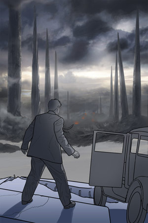
The publisher gave us pretty detailed notes. They wanted something that combined the fantastic elements of the story with the sweeping scale. I pushed for something "simple and classic" but I was unconvincing, possibly because of my lame Washington Monument cover concept. To meet the publisher's needs, Josh and I came up with this concept of Casper Cord standing on a broken highway, aghast at this alien vista of ruined spires. It was not based on any actual event in the novel, but it conveyed the concept. When we showed them this concept, about 30% complete, they were as aghast as poor Casper and told us to immediately stop. Josh and I were pretty disappointed because, hey, cool cover on the way.
Cover #3: Their Ideas
Some time after cover two was aborted I had a long conference call with the art department of Kensington. The chief designer at the time had a witch's brew of notes from various people at the company. My suggestions were sidelined in favor of a very specific series of mockups to show off at meetings. Over more than a month Josh created (if I recall correctly) six different mockups of the cover. Every detail was managed between revisions and things were added as they saw fit. The process was agonizing, but the result was, surprisingly, not that bad. Maybe aimed at a different audience than I perceived was appropriate, but I could live with it and it seemed the matter was finally settled.
Cover #4: The Many Cooks
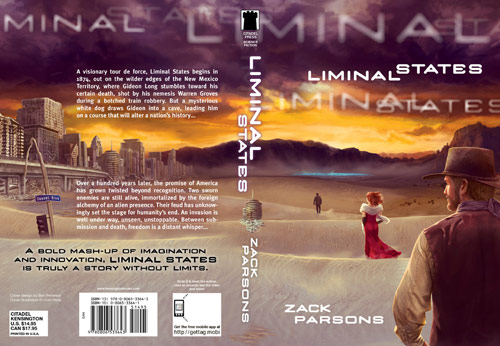
As my writing was wrapping up and missed deadlines were being missed again I finally got a look at the final cover. A number of "tweaks" had been made, none of which really worked too well in my opinion, but none of which ruined the cover either. Then about a week later I saw the image above. It felt like a young adult or romance novel with graphic design from an early 1990s album cover. I could go on and on, but the less I say the better. By this point I had also thrown up my hands on the cover copy. Hopefully you can't read what it says.
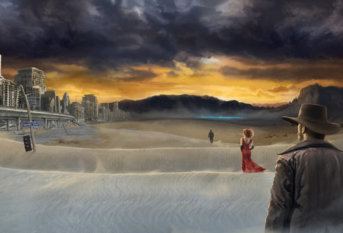
Cover #5: Last Chances
The previous cover circulated to sales outlets and everything felt final. I felt beaten. Then more changes - really odd ones like "move a ruined building to the front cover to be more science fictiony" - were suggested to appease various markets. It was too much. The final outcome on the cover was unacceptable. Dan Sollis, the guy who does the amazing video work for LIMINAL STATES engaged in a furious back and forth with the publisher. We proposed a series of last ditch emergency replacements and tried to explain the idea of creating a brand identity using the grasshopper imagery. There was no time to commission new artwork from Josh, so Dan reworked the current cover and I contacted artist Christian Schumann about the possibility of using a piece of his art - an amazing, unearthly, protean landscape piece called "under silent stars" - as the background for a royalty free grasshopper. He graciously allowed us to include his work in the pitch to the publisher. It was a simple, coherent design.
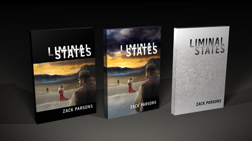
Cover #6: Back to Basics
Dan worked up a couple approaches to the grasshopper cover, along with a gloomy revision of the original Washington Monument as a last-ditch other option, and we submitted these to the publisher. They were rejected after a long review period and we seemed to be back to the degraded cowboy cover that had me in such a bitchy mood.
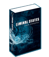
Cover #7: Everybody is Happy
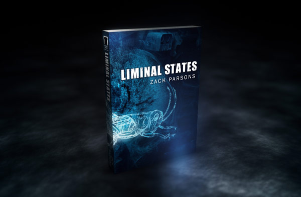
The cliche goes "it's always darkest before the light." Well, just after I started the ARG and launched youwillbecome.us the project teetered on cancellation. I was miserably unhappy with the cover, my publisher was (understandably) unhappy with my attitude and then, somehow, the grasshopper came out of hibernation. In a back and forth flurry of activity a new Kensington designer worked with me and Dan to develop the final cover you see above.
Sadly, my friend Josh's art was not able to appear on the cover because of the sudden nature of this change and Christian's art was too detailed for use on this cover, but the end result is something I am not only happy with but proud of. I am also grateful to the publisher for seeing so much of my side of the argument. Changing the cover after cover proofs had already been printed and resubmitting it to retailer catalogs was not an easy decision for them, I am sure. The whole process, as trying as it was for everyone, seems to have been worth it.
I hope you agree! Preorder your copy of LIMINAL STATES today.

|